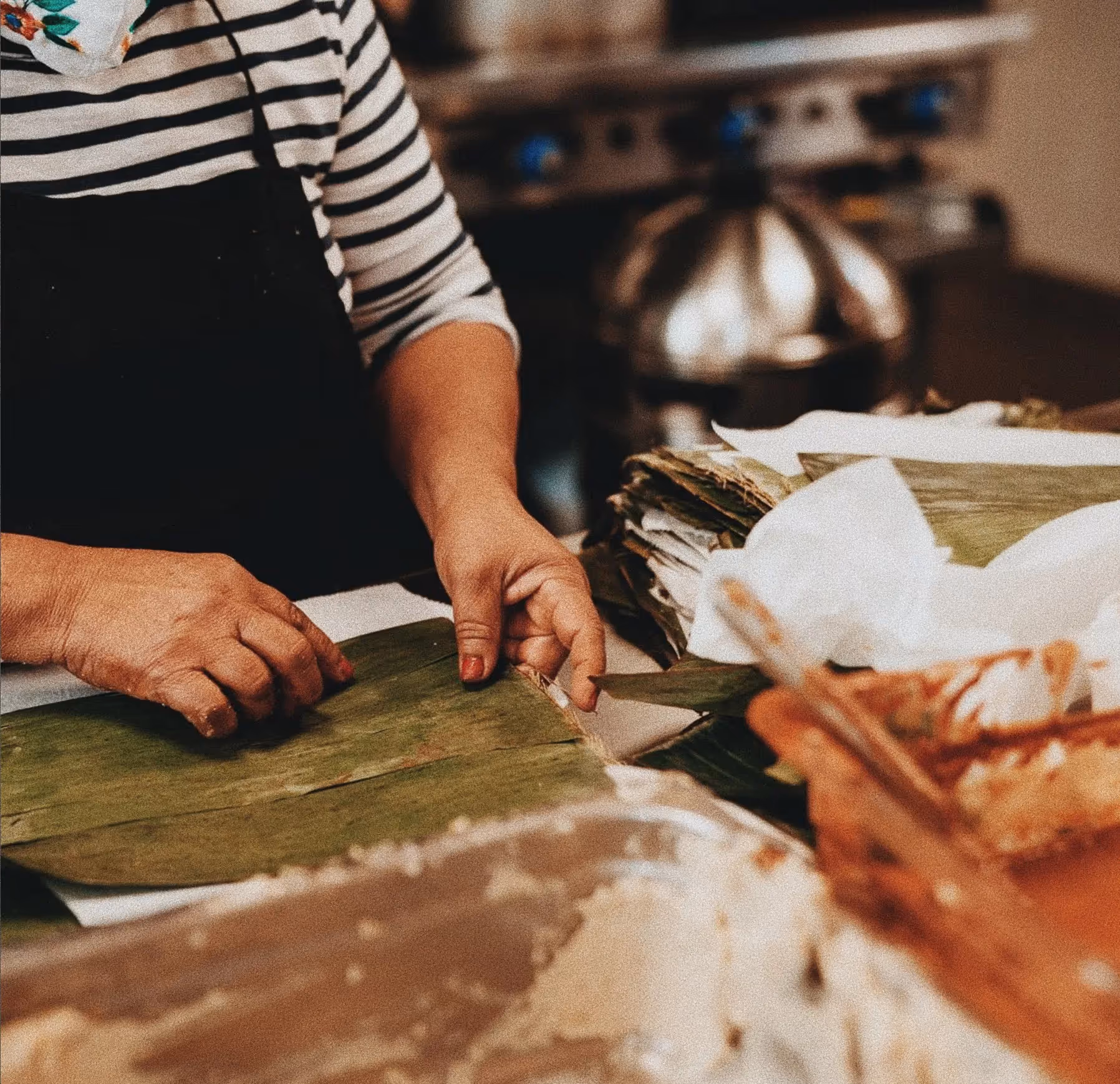
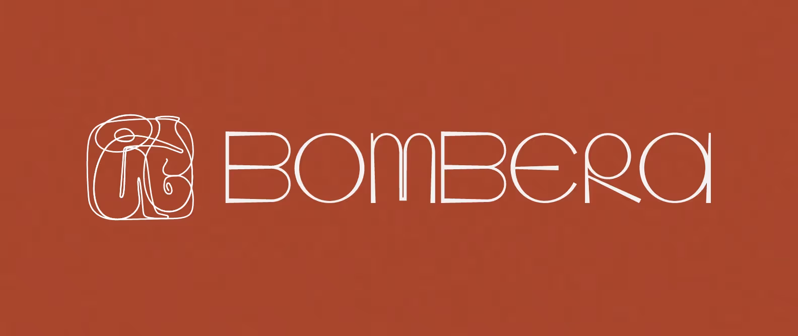
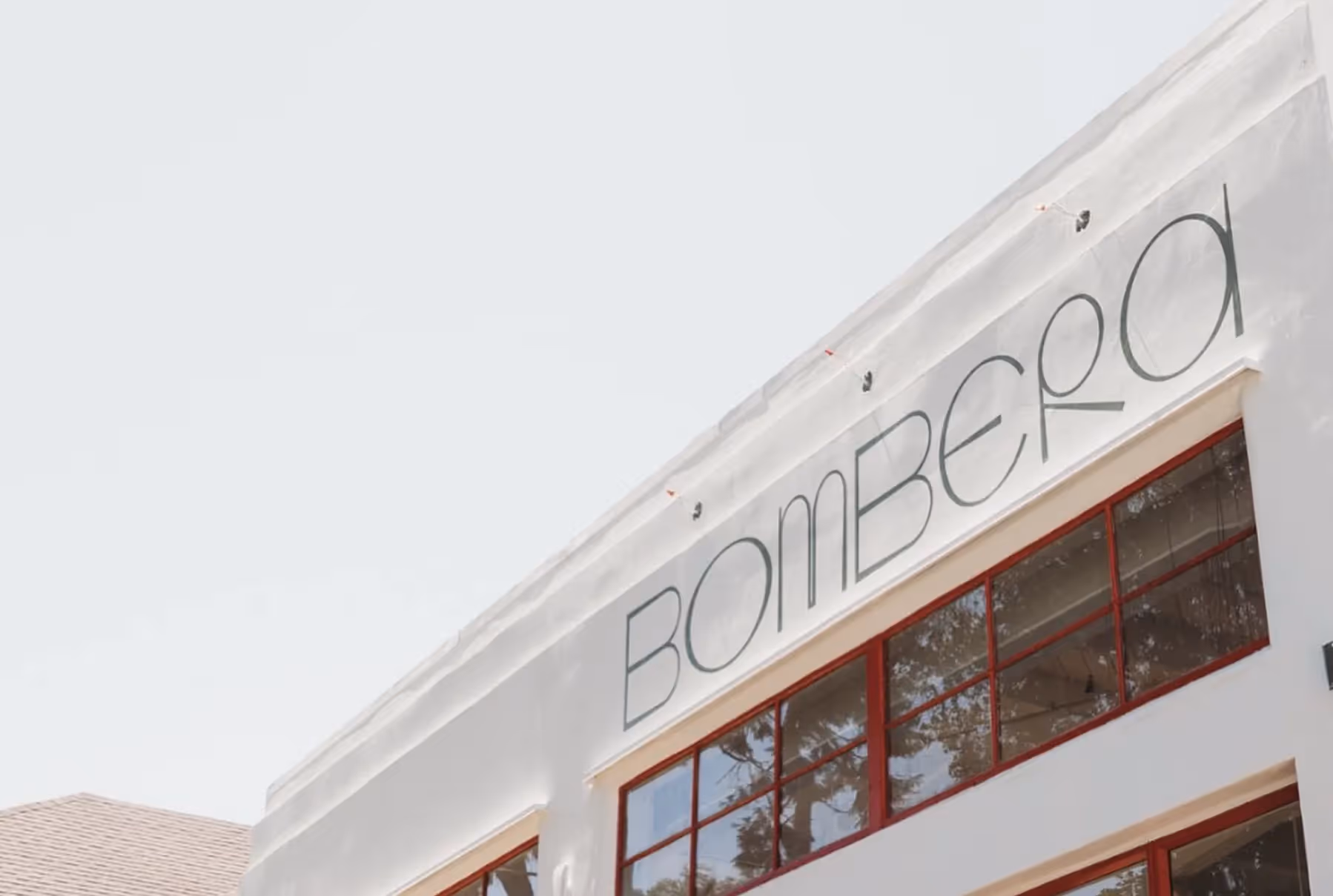
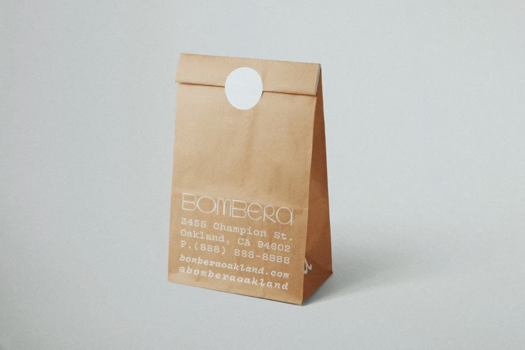
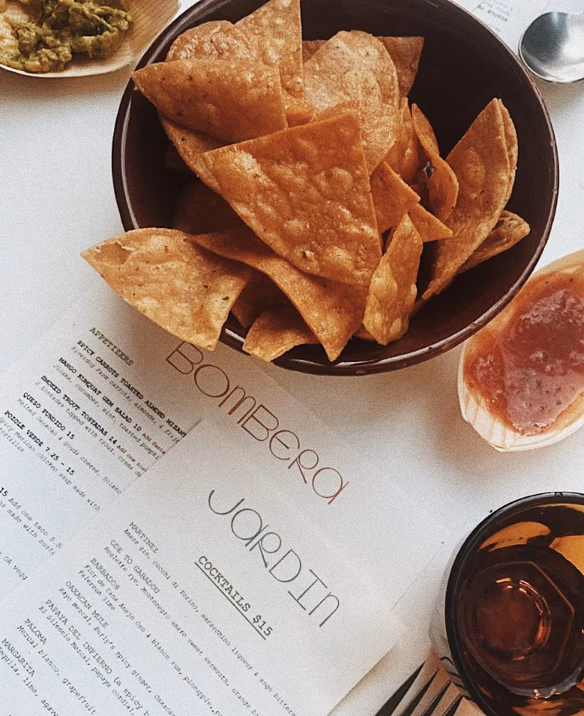
Logo and type direction for Bombera, an Oakland restaurant rooted in Mexican culinary tradition.
Bombera comes from "la bombera," meaning firewoman. The restaurant sits at the intersection of California and Mexico, and the identity needed to hold both without leaning on the visual shorthand of either. We worked on the logo and type direction, building a wordmark that reads warm and assertive at once, paired with a typographic system that travels from a menu to a hand-painted sign.


.jpg)
