Back to the top of the page
Spa interior from the DAMDAM Tokyo brand refresh, a J beauty label rooted in Japanese craftsmanship.

DAMDAM Tokyo

SCROLL

Project Details

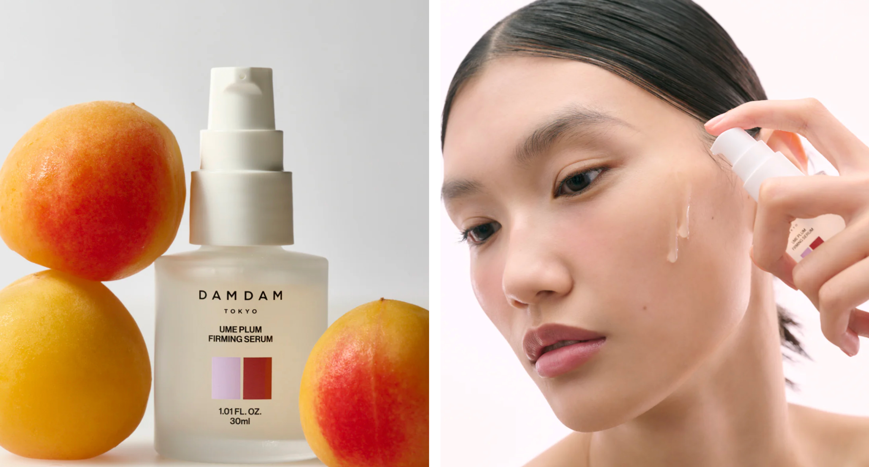
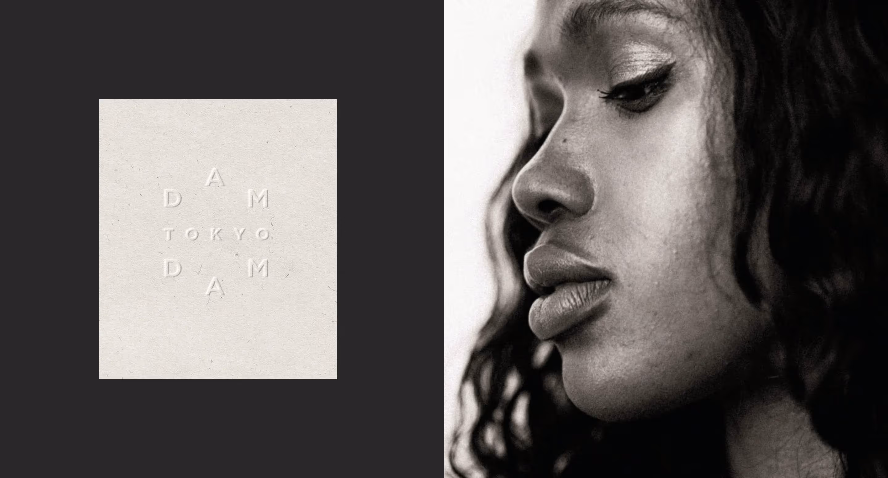
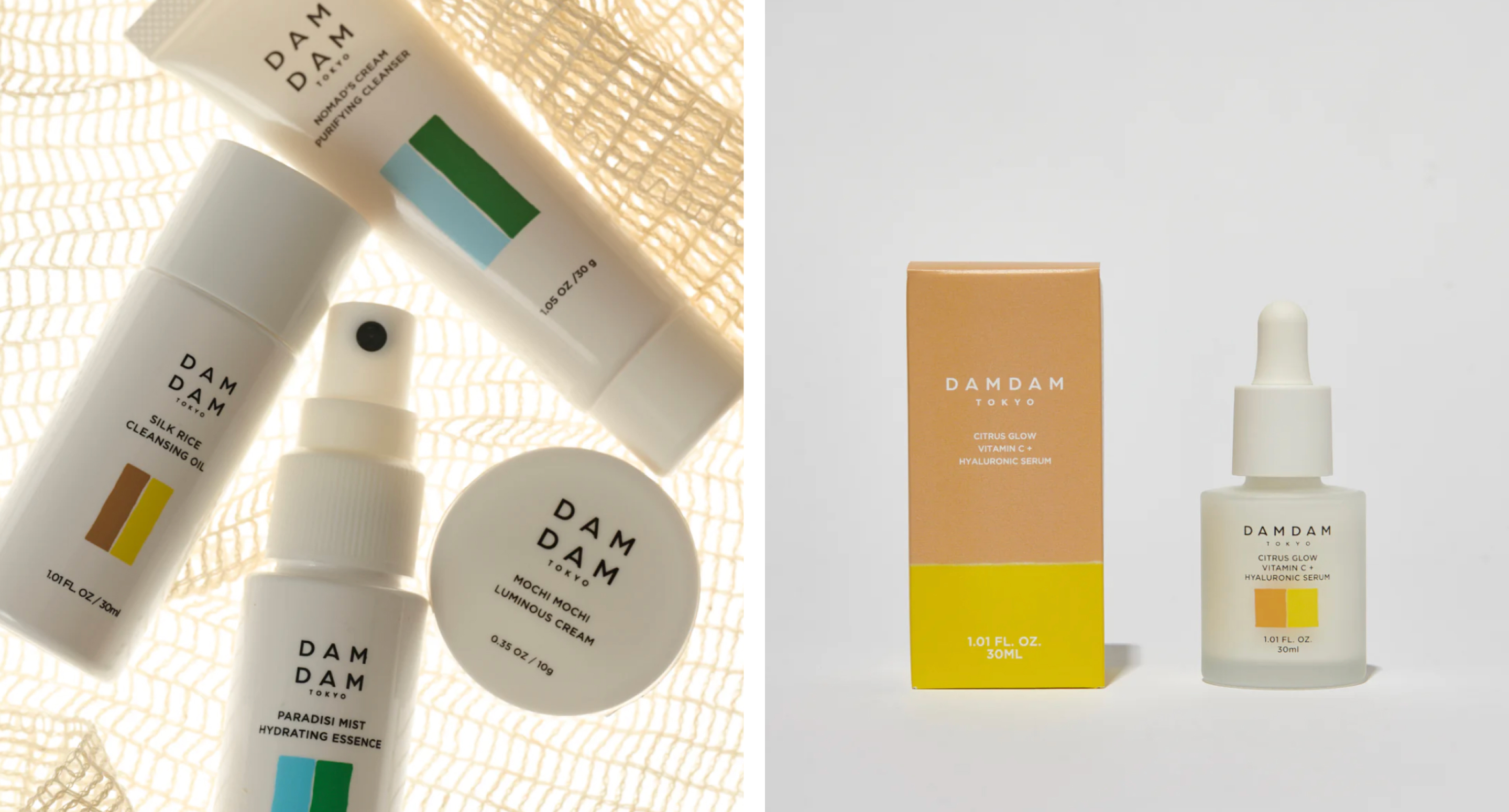
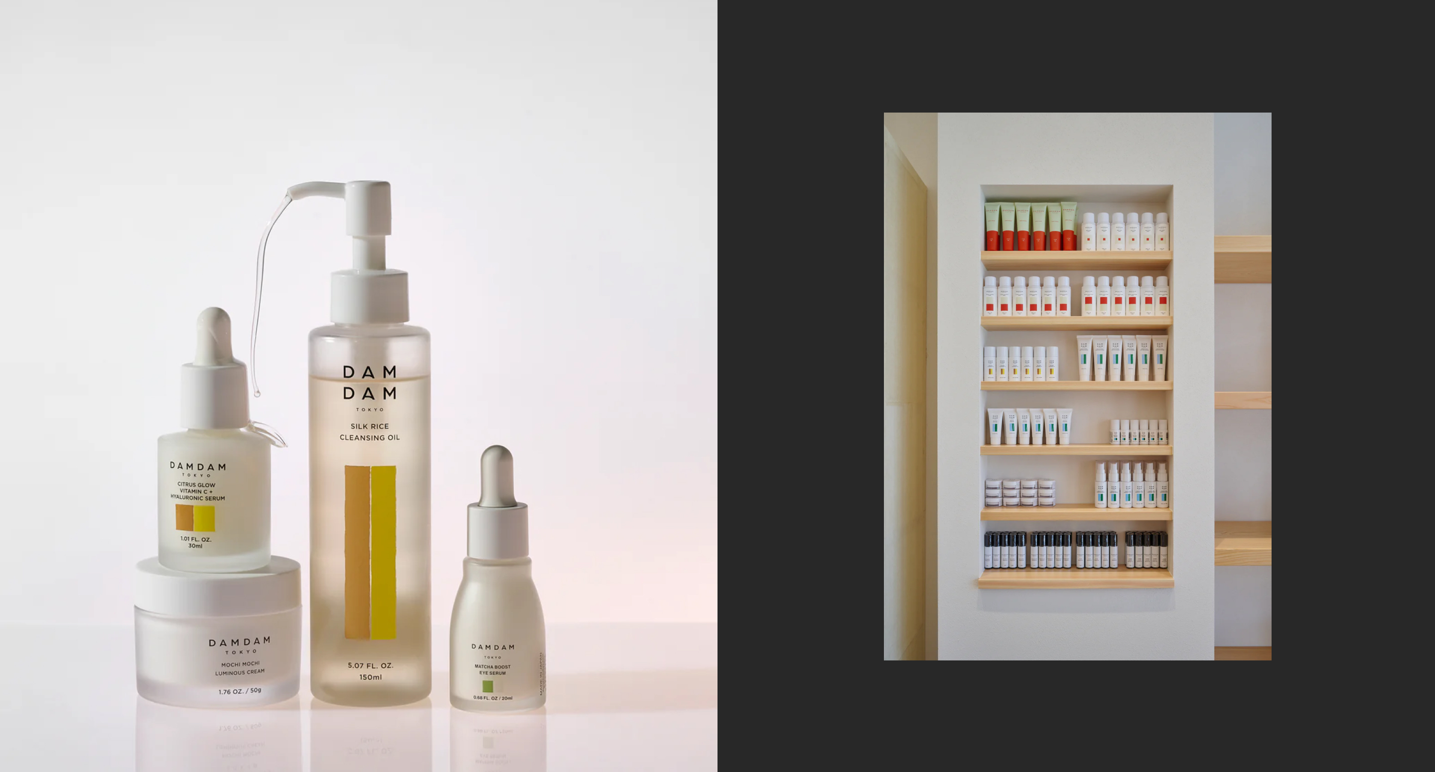
Refresh of the J-beauty brand, including logo refinement and type direction.
DAMDAM is a minimal skincare brand built around Japanese craftsmanship and plant ingredients. The work began with the logo, holding the subtle geometry of the existing 'D,' refining the letterforms, and pairing them with a warm sans-serif. From there, the refresh expanded into a cleaner aesthetic, a modular color palette, and a graphic system that holds across packaging, web, and editorial.
DAMDAM Logo
DAMDAM Web Design
DAMDAM Web Design
DAMDAM Instagram Story Design
DAMDAM Logo Mark
DAMDAM Instagram Story Design
No items found.

Related work

See all work

KEPT Home

Packaging and brand identity for a home goods label defined by elevated, tactile craft.

View Project

Pendry Hotels & Resorts Brand Campaign

Campaign and creative direction for Pendry Hotels & Resorts.

View Project
Drew Frist Studio work in context

Now booking

Have a project in mind?

Get in touch

Let's start a conversation.

Tell us a little about the project. We work with a small number of clients each year.

Thank you.

We read every note ourselves and will write back within two working days.

Something didn’t go through — email hello@drewfrist.com and we’ll pick it up.

Prefer email?

hello@drewfrist.com